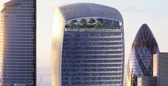
Construction has started on a new skyscraper in the heart of the City of London, and it’s certainly an odd looking thing, with the controversial top-heavy tower quickly earning itself the nickname, the Walkie-Talkie Tower.
Sky garden. Woohoo!
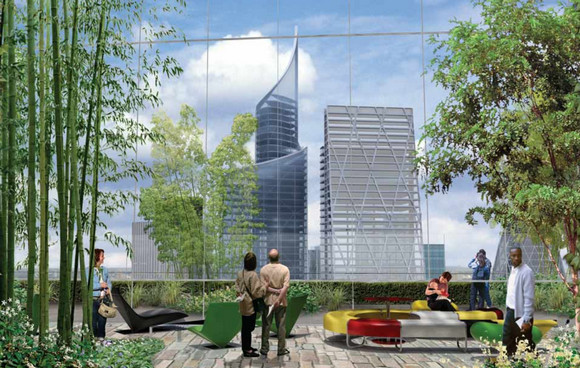
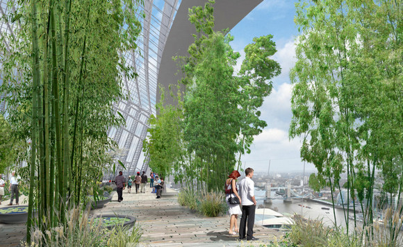
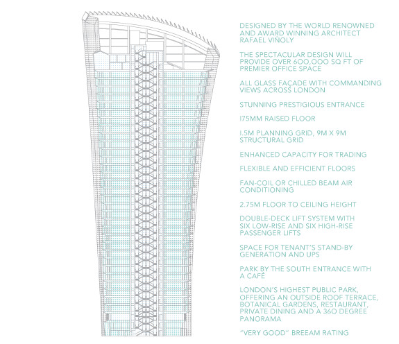
Led by Canary Wharf Group and Land Securities, the Rafael Viñoly-designed tower will reach 509ft high and cover 690,000 sq ft across 37 storeys, topped off with an interesting sounding ‘public sky garden.’
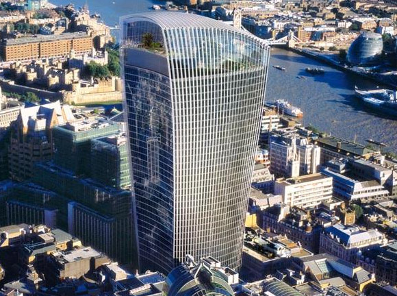
English Heritage had a fit when it first saw the plans, declaring the tower, “oppressive and overwhelming,” and planning permission had to be granted twice after a recall by Secretary of State Ruth Kelly for a public enquiry.
Not surprisingly, architect Viñoly thinks his 37-storey design is perfecto for the location:
London today is one of the most interesting architectural laboratories in recent history.
We designed 20 Fenchurch Street to respect the city’s historic character, following the contour of the river and the medieval streets that bound the site, while further contributing to the evolution of the high-rise building type.
Finished in 2014
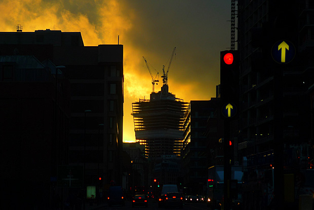
The ground breaking ceremony took place yesterday, with completion to ground floor scheduled for February 2012 and the whole thing being finished in early 2014.
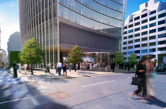
Street level render
Like a lot of new corporate developments, there’s not a lot to get excited about at street level, although you can see how relatively small the base of the tower is.
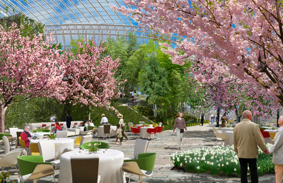
The Sky Garden
The Sky Garden certainly looks awesome in these artists renders but – and you can call me cynical here – something tells me that it won’t quite look quite as idyllic when (and if) it opens to the public.
London’s changing skyline
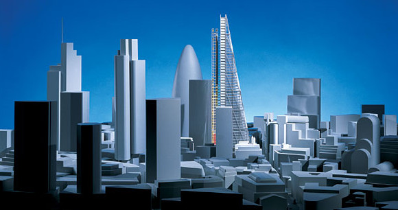
Here’s a handy graphic showing how London is changing.
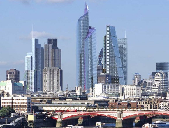
I have to say the Walkie Talkie has a horrid, oppressive air about it in this render. It looks like it’s bullying the smaller buildings around it!
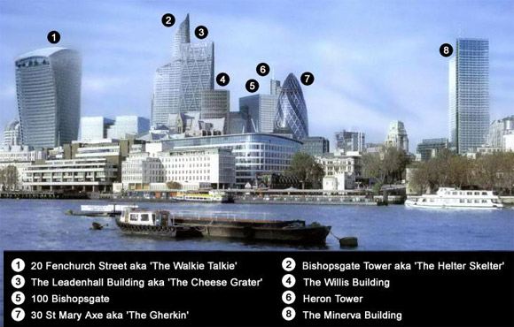
In fact, the more I see of this tower the less I like it.
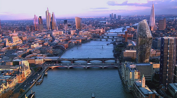
It seems out of scale, it’s inappropriately sited away from the core of city skyscrapers and it appears totally overbearing for its surroundings.
I rather like this urban75 poster’s comparison with the monster in Bugs Bunny:

In this artist’s impression below, you can see the sheer, over-sized bulk of the thing (incidentally, the beastly Mirax-Beetham tower seen to the left of The Shard on the south bank has thankfully been cancelled).
More views: [from the official site]
Watch dull developers drone on about it!
Here’s a crackly video full of boring blokes in grey suits babbling on about the new tower and, err, money.
Official site: http://www.20fenchurchstreet.co.uk/

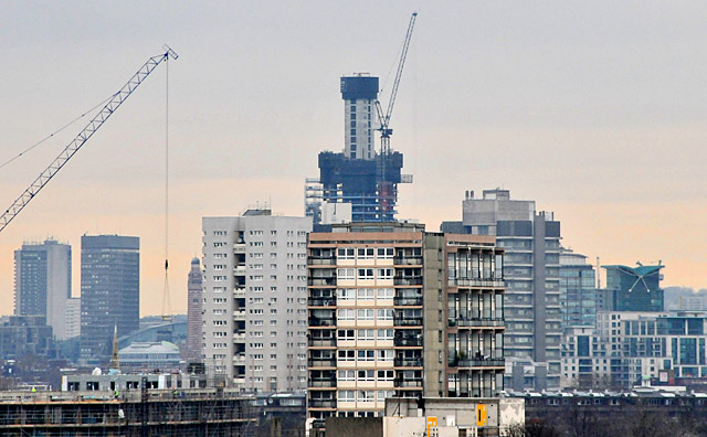


Useful material on this unwanted building. People seem to have become very passive, even down to accepting the names thought up by the developers of such buildings. This one looks very little like a walkie-talkie, which are neither glass-sided not much thicker at the top. What it does look like is a hunchback.
And the builders are facing unwanted consequences right now, regarding the concave surface on the south facing part of the building concentrating sunlight. A mathematician at Uni. Nottingham reckoned that this building is concentrating sunlight as much as ten to twenty times at the surface of the pavement below.
Starkly modern and gleaming bright, I was mightily impressed when I got out of the lift at the top and walked into the cafe area, even if the finished product bears little relationship with the original renders:Great blog nice and useful information. It is very helpful for me , I really appreciate thanks for sharing.