|
|
 Creating a navigation system
Planning and building a navigation system for your website
By Mike Slocombe for Internet Magazine, May 2004
The average web surfer has the patience of a chemically enhanced cheetah with racing stripes.
They haven't got time to fanny about with wobbling animations, quirky interfaces or obscure links. They want to get to the content - and fast.
A well designed site should offer a simple, clear, intuitive navigation and layout that says to visitors, 'this is what we've got and here's how to get to it'
 If you're running a bijou site of just a few pages, a simple set of explanatory links listing all your content will do fine.
But if your site runs into hundreds or thousands of pages, you've got some work to do.
You'll need to organise your site's content into themed categories, each with a clear and logical title, and then tie them all together with a site-wide navigation system.
It's vital that you plan your navigation very carefully, because changing a site's structure later on can be a king size pain in the Quantocks.

Herd your wild pages into neat little virtual pens.
Now, this might sound oh-so last century, but when it comes to planning a site, you really can't beat breaking out pen and paper and sketching out an overview of your site.
Write down your proposed subsections and see how the content fits in, making new categories and sub-categories when appropriate.
But don't go mad though - the more categories you throw in, the more likely you are to overwhelm the user, so only create a subsection if there's enough content to justify it.
If you end up with more than 10 -12 subsections, you may need to rethink your site's organisation.
Ideally, you should end up with all your subsections sharing roughly similar amounts of content and all pages being accessible in no more than three clicks.
Your subsections will become the prime elements of your site's top level navigation, so it's important to ensure that have very simple and blazingly obvious titles (e.g. 'about me', 'my work', 'my hobbies' etc).
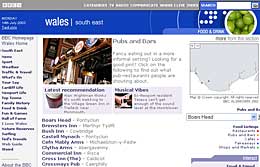
For larger sites, you may need to provide a 'subsidiary navigation' menu, which displays all the content relevant to a subsection, as well as a 'secondary navigation' with links to other important pages (e.g.' search | contact us | site map' etc )
Although each subsection will obviously have a different set of links, it's important that these menus appear in the same place on the page, whichever page of your site visitors end up on
We also strongly recommend that you make sure that you include a text only version of your navigation - not only will this make the site more accessible to all, it will also lure search robots into spidering all of the content on your site.
WHAT BAR?
Navigation bars come in all shapes and sizes, from a line of text links to multi-tiered, interactive extravaganzas.
Whatever style you choose, it's vital that users can instantly recognise the navigation bar and have a good idea where clicking on its links will take them.
As ever, it's important to choose a style of navigation that is appropriate to the style and theme of a site - so you've only got ten paltry pages online, perhaps you don't really need those three rows of spinning icons along the top of the page!
Some web authors like to get a bit arty, draping their navigation in fanciful metaphors, oblique icons or a 'challenging' interface.
Although such cray-zee design can be perfectly acceptable for experimental portfolio sites, most people will rapidly lose interest in trying to find which animated blob leads where, so our advice is to keep your navigation as simple as possible.
Using icons
Graphic icons can be a great way to add graphic interest to a navigation bar, but they should be unambiguous, understandable, legible, informative and distinct.
Those's quite a challenge if you've only got a few pixels to play with, so include a text description with each icon and add explanatory 'ALT' text information.
Remember: navigation is there to help people find the content on your site, not to baffle, bemuse or befuddle them.
|
