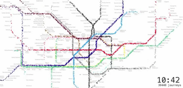
I’m loving this clever animation that visualises passenger traffic on the London Underground across the course of a day.
Compiled from 562,145 journeys on the London Underground network, using a 5% sample of Oyster-card journeys during a week in 2009, the video shows the sleepy start to the day with early birds catching the first trains.
As the day wears on and the rush hour approaches, the lines come to life, with the visualisation predicting an individual’s route across the capital via a custom written journey planner.
The animation is the work of tech wizard Will Gallia, who explains that the journey planner and route finder were both written in Python and the visualisation was created using C++ with openFrameworks and GLSL for the position computation.
I’ll pretend that I know exactly what that means.
Find out more about how it was all put together here.

