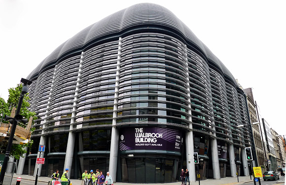
Workmen putting the finishes touches to the striking Mann Island development on Liverpool’s waterfront.
The large-scale development by Neptune Developments and Countryside Properties comprises of 376 one, two and three bedroom apartments, plus office space and leisure facilities.
The shiny black monolithic slab has drawn contrasting opinions from locals and architectural experts alike.
Gavin Stamp, architect, historian and trustee of the 20th Century Society was immensely unimpressed by the buildings:
They should not be built. Not only is this a World Heritage Site, but there needs to be a break between the great 20th century group of the Pier Head’s Three Graces and the 19th-century group of the Albert Dock. It was fine as it was with low-level buildings between the landmark groups, acting as a buffer zone so that neither of those groups are overwhelmed.
[Similar dockside view, 1911]
Meanwhile, Alistair Sunderland, architect and a member of the Ludcap panel was feeling the love, but loses the argument for the use of the word ‘vibrant’:
The polished granite cladding is …[a] contrast with the brilliant white of the neighbouring Port of Liverpool Building and the new Museum of Liverpool…As a neighbour, it’s a complementary contrast to the new Museum of Liverpool. “One’s black and shiny, the other’s white and matt. They both use building shapes which are not familiar in our vocabulary and I think they make a very positive contribution to making the waterfront seem vibrant.
Ptolemy Dean, architect and presenter of BBC 2’s Restoration programme disagreed:
The whole group of original buildings is brilliant. Until recently, by sheer good fortune, the clarity of Liverpool’s greatness as a port and 20th- century commercial centre was preserved. It’s the spaces between the buildings that matter and that’s being taken away, with the wonderful sense of the skyline, so we are losing a vital part of the story. The three new granite block buildings are like sitting in an opera and hearing a mobile phone go off. The illusion is shattered by something interrupting it.
I rather like the look of it, but then I don’t know what it looked like before, and can see that it’s one hell of an architectural statement to impose on people. I can certainly see why some aren’t too chuffed.
What do you think? Love it? Hate it?
Read more about the controversy behind this development here and see the developer’s site here.

