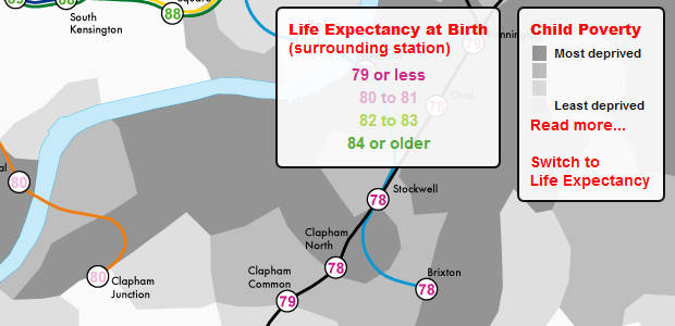
This intriguing map uses a novel way to highlight London’s social inequalities, demonstrating how where you live can have a dramatic impact on your life expectancy rates.
The data is projected over a tube map, and also includes the rank of each London ward on the spectrum of Income Deprivation Affecting Children Index
Looking at the map, you can see that someone living in leafy Clapham can expect to live two years longer than someone in nearby Brixton.
For Brixtonites (and those in nearby Stockwell), expectancy is pegged at just 78 years – close to the lowest age found in the survey.
Move into Lancaster Gate and Marble Arch however, and life expectancy soars to 91 years – compare that to the mere 75 years found in the most deprived parts of East London.
Here’s how the developers describe their map and some of their findings:
The map shows two key statistics: 1) the life expectancy at birth of those living around each London Underground, London Overground and Docklands Light Railway (DLR) station and 2) the rank of each London ward on the spectrum of Income Deprivation Affecting Children Index (IDACI).
The inclusion of the IDACI rank highlights the linkage between deprivation and life expectancy, which is especially poignant in this context as it demonstrates that, without significant social change (obviously, if the social composition of London changes radically then the life expectancies at each station will change with it), the fates of many children living in the poorest parts of London are seemingly already sealed.
Whilst the average life expectancy predictions show that today’s children are expected to live longer, the range is startling. For the stations mapped, it is over 20 years with those around Star Lane (on the DLR) predicted to live, on average, for 75.3 years in contrast to 96.38 years for those around Oxford Circus.
The smaller disparities are no less striking. For example, between Lancaster Gate and Mile End (20 minutes on the Central line) life expectancy decreases by 12 years and crossing the Thames between Pimlico and Vauxhall sees life expectancy drop by 6 years. The stations serving the Olympic Park fair badly and contrast with the Olympic volleyball venue at Earl’s Court whose spectators will be passing through areas with far higher life expectancies and lower child poverty
Read more about this fascinating project here: Lives on the Line: Life Expectancy and Child Poverty as a Tube Map

