|
|
Palm Treo 500v Pocket PC Review
Is Palm's new entry level smartphone good enough to take on the Blackberry Curve?
Review by urban75 for Digital-Lifestyles, 20 Sept, 2007
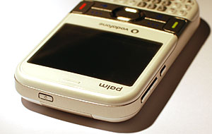 As anyone who has been tracking the various ups and (considerable) downs of Palm's fortunes recently will know, there's quite a lot hanging on this latest release for the company. As anyone who has been tracking the various ups and (considerable) downs of Palm's fortunes recently will know, there's quite a lot hanging on this latest release for the company.
Although both Windows and Palm OS versions of their Treo smartphones sold pretty well and received generally good reviews, there has been growing discontentment amongst loyal followers that Palm's Innovation Dept have been on an extended dinner break for too long.
After all, the form factor of the recent Treo range has barely altered physically from its Handspring days, with the recent Palm 680 offering very little over their long serving Treo 650 handset.
Early this year, the company launched their first Windows Mobile Treo phone, the Treo 750v (reviewed here in May 2007), and although it garnered praise for its usability and feel, we felt it still lagged behind the market leaders.
 The Treo 500v sees Palm coming up with their first real new design for years, targeting the handset at the 24-35 year old business/consumer demographic. The Treo 500v sees Palm coming up with their first real new design for years, targeting the handset at the 24-35 year old business/consumer demographic.
Available in two colour schemes - dark grey/silver and white/silver - and given away free with some Vodafone contracts, the 500v presents a sleek, modern and affordable look that invites comparisons with the Blackberry Curve.
Considerably slimmer than its Treo predecessors, the phone measures 110mm x 61.5mm x 16.5mm (4.3" x 2.4" x .65") and weighs just 120g (4.2oz) in total. Not bad at all for a phone sporting a QWERTY keyboard and a decent sized screen, and positively anorexic compared to the lardy lines of the previous Treo range.

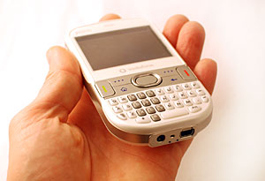 In the hand In the hand
Our first impressions of the phone were very positive. Although the white finish is asking for trouble with messy types like us (we prefer the look of the grey number), the handset looks fresh, contemporary and rather stylish to our eyes. It felt pretty sturdy too.
The 320×240-pixel screen was bright, clear and crisp and easy to read in sunlight. We also had no problems using the phone at night, with a strong backlight illuminating the entire keypad and control keys.
A metal strip across the centre of phone contains four flush buttons, an oval 'D' pad and the call start/end buttons, but despite some initial misgivings about the ergonomics, we found the controls very responsive in use.
 The keyboard The keyboard
The problem with trying to wedge a QWERTY keyboard onto a compact mobile device is that something has to give: make it too small and it becomes unusable to all but pixie-fingered peckers; make it large enough to comfortably type on and you'll end up with a pocket ripper.
Some manufacturers have opted for slide-out keyboards or virtual onscreen keyboards, but these invariably render the phones pretty useless for one handed operation.
 While there's no denying that the keys on the 500v are pretty small and not for sausage fingered prodders, we liked it and had no problems knocking out texts and emails. While there's no denying that the keys on the 500v are pretty small and not for sausage fingered prodders, we liked it and had no problems knocking out texts and emails.
The slim and wide shape of the phone meant it sat nicely in the hand and was substantial enough to let us type messages one handed with our thumb.

Turn it off!
We can only assume that Palm's designers had been passing the crack pipe around when they arrived at the decision to remove the sound on/off slider from the top of the phone.
It was one of simple but craftily inspired selling points of previous Treos - and a ruddy brilliant idea to boot - so we can't imagine what possessed Palm to remove this must-have feature. It's a really frustrating omission and we hope they put it back for the Centro.
At the bottom of the unit is another annoyance with Palm sticking to a 2.5mm headphone socket instead of an infinitely more useful standard 3.5mm jobbie.
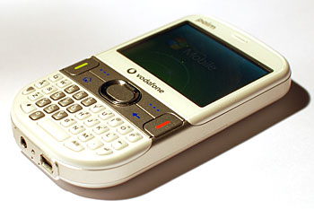 Happily, Palm have finally moved away from their proprietary connectors and added a mini-USB slot, so it's not all bad. Happily, Palm have finally moved away from their proprietary connectors and added a mini-USB slot, so it's not all bad.
Looking to the left hand side of the phone, there's two buttons for volume up/down and a dedicated button for launching Internet Explorer.
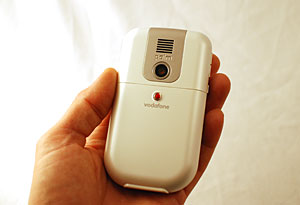
Spinning the phone around, we can see a 2MP camera at the back and speakerphone grill. Thankfully, they haven't bothered with those pointless face-distorting convex mirrors that turns your face into a fairground attraction.
At the top of the phone sits the power on/off button.
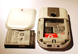 A look inside A look inside
Getting the back off the Treo took a bit of a Herculean effort - so much so that we were fearful of breaking the thing.
Once we'd finally slid off the back cover, we found a user replaceable Li-ion 1200MaH battery sitting tightly inside with the SIM and miniSD card slots lurking below.
Taking out and inserting cards from both slots was straightforward enough, although we wouldn't like to make a habit of getting the back off.

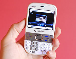
Booting up the Treo for the first time took around 30 seconds, with a succession of logos appearing on screen: first the Palm logo, followed by Vodafone's animated feast of redness and finally the Window Mobile branding.
Interface
With no touch screen onboard, menus are navigated via a strip of controls contained in the silver band running across the middle of the phone.
Clicking the 'start' button takes you to Vodafone's slick tabbed interface which we found exceptionally easy to use.
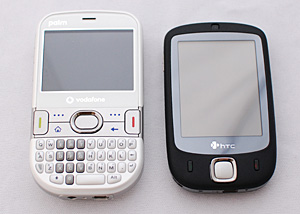 Pressing the left/right controls on the Treo's 'D' Pad lets you scroll through various interfaces labelled Message Centre, Favourite Contacts, Upcoming Events, My Settings, Windows Live, Music & Video, Recent Photos, Live! and Recent Programs. Sub menus were selected using the up/down controller with the central button being used as an OK/launch button. Pressing the left/right controls on the Treo's 'D' Pad lets you scroll through various interfaces labelled Message Centre, Favourite Contacts, Upcoming Events, My Settings, Windows Live, Music & Video, Recent Photos, Live! and Recent Programs. Sub menus were selected using the up/down controller with the central button being used as an OK/launch button.
Going through the tabbed screens, the Message Centre tab affords one-click access to text, MMS, email, voicemail and missed calls, Favourite Contacts offers quick access to your best chums, My Settings lets you set ring tones, home screen wallpaper, alarms and profiles and also turn Bluetooth and Flight mode on/off.
The Windows Live tab provides access to Live Messenger, Hotmail, Live Spaces and Search, with Music & Video displaying all the media you've got squirreled away on your phone and memory card. Recent Photos displays thumbnails of your last snaps while the Live! tab connects you to Vodafone Live!, eBay, Google Maps, Business email, Mobile TV and Internet Explorer.
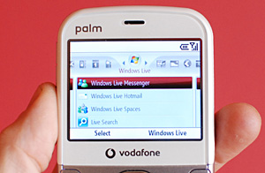 Recent Programs does exactly what you might expect, and presents a list of the last programs accessed on the phone. Recent Programs does exactly what you might expect, and presents a list of the last programs accessed on the phone.
Throughout the testing the interface was snappy, responsive and pleasingly simple to use. We didn't experience any crashes and have to say it's one of the best interfaces we've used on a Windows smartphone to date (and we usually end up screaming at them).
We certainly preferred it to the skin-deep glossy veneer of the HTC Touch we reviewed recently, and seeing as Palm forgot to give us a user manual, it's testament to the UI that we very rarely found ourselves getting lost.
You can judge for yourself with this video posted here:
|