|
|
 Promote your skills online
Build a portfolio website and show your CV to the world!
By Mike Slocombe for Internet Magazine, May 2004
Whether you're a freelance designer, struggling artist, independent plumber or unicycling juggling clown, hawking for work can be a soulless experience.
 1 Organise your content
Write down the skills you wish to promote on your site.
Concentrate on promoting your key abilities rather than trying to impress people with an exhaustive list of things you're vaguely good at.
If you happen to be a fantastic potter as well as a superb mud wrestler, consider building two separate sites - the more your site specialises, the more likely people will be to find it.
2. Work out your keywords
 Work out your keywords. These are the words that a potential client looking for your services might type in to a search engine.
A local Brummie business is hardly going to want to hire a signwriter from Baghdad, so make sure that your keywords reflect your locality.
Download free keyword software from Good Keywords
3 Check out the competition
Fire up Google, type in your keywords and see what sites come up.
Your mission is to get to the top of the pile, so take a good look around and see what you can learn from the highly placed sites.
4. Write an introduction
 A well written, keyword loaded, clear and concise description of what your site offers will help both visitors and search engines.
Slap it on your homepage and use down to earth language.
Put yourself in the mindset of a prospective client - would they be looking for a 'virtual visioneer' or a plain and simple 'website designer'?
Be sure to triple check your words for spelling and grammatical errors!

5. Get the tone right
Make sure you find the appropriate tone for your website - a page full of hip-hop slang may not be quite right for a business consultant's homepage.
The formal tone of a CV may seem a little stiff for an online portfolio site, so make your words a pleasure to read and low on waffle.
Don't make your pages too long and don't assume that those responsible for hiring staff will understand your deeply technical prose.
6 Keep it simple
 Target your website design to the audience you're trying to please.
Unless you're a Flash designer specialising in impenetrable, interactive interfaces, keep your design simple and direct.
Remember, clients aren't coming to your site to be amused by your cray-zee games or wowed by your HTML wizardry - they want to what relevant skills you have.
7. Structure your site
Organise your content into logical and understandable subsections, with a clear and consistent navigation.
Make it easy for visitors to find your work and include full background details (client, date of commission etc).
Don't put up really old stuff unless it's relevant to what you're doing now. Make sure that there's a link on every page to your contact details.
8. Backslap!
 Be sure to point prospective clients in the direction of any favourable press articles about your work.
Chuffed-to-bits customer testimonials can prove very persuasive so big them up on your site and link them from the relevant portfolio page.
List any awards you've won, but only if they're credible - a 'Billy Widget's Wacky Site of the Week' award may fail to impress a corporate head of department.

9. Show a little personality
 Help a prospective client know if you're the right person for the job by telling them something about your interests and hobbies.
No one wants to hire a miserable git, so try and put across some enthusiasm.
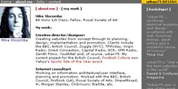
Unless you've got a face than can turn milk sour, a mugshot might be a welcome addition.
Be mindful of safety and privacy issues and don't post up your home address/phone number.
10. Offer your CV
Many companies still insist on seeing a traditional CV and a really duff one may seriously dent your chances of getting work - so take time out to get it right!
There's always the chance that your downloadable CV will be in the wrong format for some clients - play safe by offering PDF, Word and HTML versions.
PDF info:
Planet PDF
Adobe Acrobat
Convert a document to .pdf
11 Take the credit
 If there's an opportunity to get a published credit for your work, try and get your website address included.
Link popularity is taken into account by search engines like Google so try and bump yourself up the rankings by encouraging people to link to your site.
12. Keep it up to date
Make sure that your site is regularly updated and your contact details are correct.
Flag up new content and keep your CV bang-up-to-date.
If you're linking to examples of your work on external websites, periodically check them - many a web designer has become unstuck when their lovingly designed site has subsequently been redesigned by a drunken, colour-blind acid casualty.
More info:
Putting your CV online
Writing a CV
Resumes 101
|

