|
|
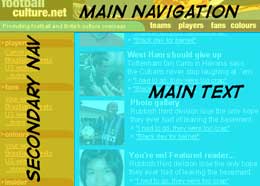
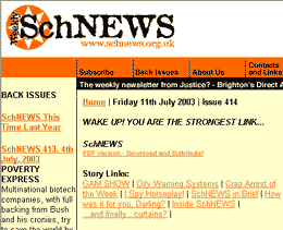
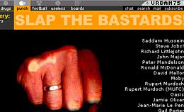
 Creating a navigation system:
Putting your nav bar together
By Mike Slocombe for Internet Magazine, May 2004
1. Design the layout
 Open up your favourite paint package and experiment with different navigation layouts and colour schemes to see which is going to suit your site best.
If you've already built a site, draw your ideas on top of a screengrab of your homepage.
If you're stuck for inspiration, check out the navigation section in Cool Homepages or find out more here: 'Designing Effective Navigation'
2. Categorise and colour code
 Work out a logical order for your main categories. Bear in mind that most people will scan the nav bar from left to right, so place the most important categories to the left.
If you're using icons, make sure that they're clear and deadly obvious.
Consider using colour to differentiate different sections of the site, but make sure they all go together!
3. Branding
 Branding is about making your pages instantly recognisable, and a site's navigation can play a major part in this.
A website can be branded by a combination of design elements, including colour schemes, layout, look and feel and, of course, the logo.
It's long been internet practice to incorporate the logo in the navigation bar and make it a clickable link back to the homepage
4. Let people find themselves
 A good navigation system should make it easy for visitors to find out exactly where they are in relation to the site and what relevant options are available.
If you're using iconic navigation, 'light up' the appropriate icon for all the pages in that subsection (if you're using a text-based navigation, change the colour and/or boldness of selected subsections)
|

