|
|
 Creating a navigation system:
Additional navigation widgets
By Mike Slocombe for Internet Magazine, May 2004
1. site map
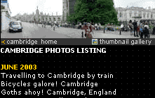 Adding site maps can improve your site's navigation, offering a comprehensive listing of a site's structure and contents.
Providing a link to the site map from every page will not only help users find your content - it may help bump you up in the search engine rankings!
If your site is ruddy ginormous, you may want to consider introducing additional site maps for each subsection.
2. search box
 A link to a search page (or an embedded search box) on every page can help users find stuff quickly, especially if you're running a large site.
If you're technically minded, there are loads of free scripts available at sites like CGI Resources and Script Search, otherwise you can use the free search services at Atomz, PicoSearch and Freefind.
Google now also offers an excellent free customisable search service: Add Google SiteSearch to your site
3. drop down menus
 These can prove to be an effective way of presenting multiple choices without hogging too much screen space.
Because of usability issues, they should never be the sole means of navigating a site.
Use these online tools to create your own custom drop down boxes:
Drop Down Menu Creator
JavaScript Drop Down Navigation Creator
4. image maps
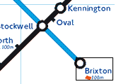 Image maps let you assign 'hotspot' links to a graphic, so that users can access pages by clicking on different areas of the image.
Although these are a great way of graphically presenting a set of links, you should always provide text alternatives.
Image map tutorial: Irt.Org
5. breadcrumb trails
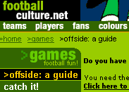 Breadcrumb trails are a set of HTML links showing the route from the current page back up to the homepage: e.g.
Home > Sports > Football > Titans of the Turf > Cardiff City
These can be a handy navigation aid, providing a welcome addition to the standard navigation bar without hogging too much valuable screen estate.

6. up buttons
Peppering long documents with 'up' or 'back to top' buttons is a great way to save your visitors wearing out their mouse scroll wheels.
These can take the form of a simple text link or a graphic.
To create a text 'up' link, simply place this bit of code at the top of your page <a name="top"></a> and then add this in the body of your text wherever you want the up link to appear <a href="#top">top of page</a>
7. Javascript rollovers
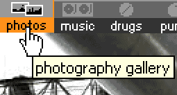 This simple effect works well on graphic menus, giving users visual feedback when they put their mouse over an icon.
Many graphics/web authoring packages can produce the code automatically for you.
More info:
JavaScript Rollovers Tutorials
Animation With JavaScript
8. Pop up
 If you've ever accidentally stumbled on to a porn site, you'll no doubt be acquainted with the curse of the pop up browser window. If you've ever accidentally stumbled on to a porn site, you'll no doubt be acquainted with the curse of the pop up browser window.
Some sites are foolish enough to make these windows their primary navigation, clearly oblivious to the fact that most people instantly swat them on sight - or use software that automatically blocks them.
Although we would definitely not recommend pop up windows to be used for any prime navigation functions, they can be useful ways of displaying small amounts of information. Check out our 'how-to' tutorial here.
9. The kitchen sink approach
 With all these fun toys to play with, it might be tempting to slap them all on your page in the misguided belief that the more choices you give your visitors, the better. It's not.
Keep your navigation clear, concise and make sure that it's as simple to use and as accessible as possible.
» Building accessible navigation
|

